Decoding the Dragon: Harry Potter and the Goblet of Fire's Cover
Does the iconic artwork for J.K. Rowling's fourth Harry Potter book truly capture its escalating magic and peril? We dive deep into book cover design.
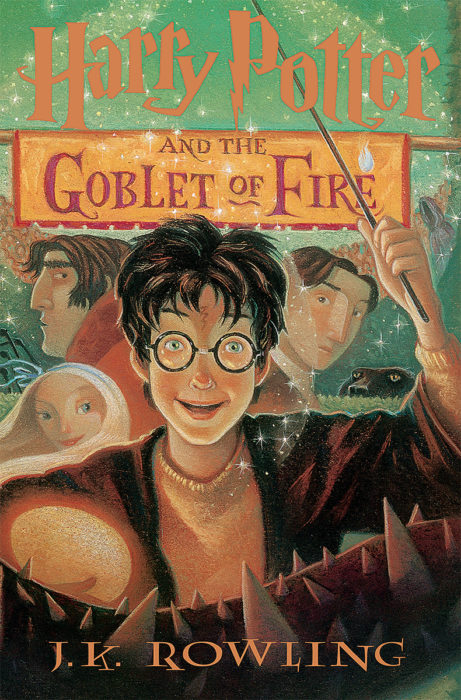
We've all heard the adage: "Don't judge a book by its cover." Yet, in a bustling bookstore aisle or scrolling through endless digital libraries, it's often that initial visual spark that draws us in. A compelling cover isn't just decoration; it's a silent storyteller, a marketing masterpiece, and often, our very first introduction to a new world. Today, we're casting our critical eye on one of the most beloved entries in modern fantasy, Harry Potter and the Goblet of Fire, to see if its iconic artwork truly stands up to the epic tale it contains. Does its cover perfectly capture the essence of its narrative, or does it leave us wanting more?

The Magic of First Impressions: Unpacking Harry Potter and the Goblet of Fire's Cover
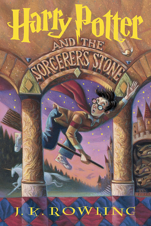
When J.K. Rowling's fourth installment, Harry Potter and the Goblet of Fire, hit shelves, it marked a significant turning point in the series. The whimsical innocence of earlier books began to give way to darker, more mature themes, and the covers evolved right along with them. The classic UK Bloomsbury edition, illustrated by Giles Greenfield, or the iconic US Scholastic covers by Mary GrandPré, both offer a rich tapestry of visual clues. For our analysis, let's consider a common, powerful representation – one that typically features Harry mid-action, often facing a dragon or some other immediate peril, bathed in a fiery glow.
The chosen cover for Harry Potter and the Goblet of Fire usually bursts with dynamic energy. We see Harry, older and more determined, often with his wand raised, against a backdrop of intense magic and danger. The color palette typically leans into fiery reds, oranges, and deep blues or purples, instantly signaling a shift from the brighter, primary colors of the initial books. The typography for the title itself often becomes bolder, sharper, reflecting the escalating stakes within the pages. This isn't just a simple school year anymore; it's a high-stakes competition.
A Perfect Portrayal? What the Cover Gets Right
The cover for Harry Potter and the Goblet of Fire is a masterclass in visual foreshadowing and genre signaling. The immediate depiction of action and a formidable creature (often a dragon or an underwater scene) instantly communicates the central plot point: the Triwizard Tournament. This multi-tasked magical competition is the backbone of the narrative, filled with dangerous tasks that push Harry and his friends to their limits. The cover's imagery doesn't just hint at this; it shouts it, drawing in readers who crave adventure, magic, and thrilling challenges.
Furthermore, the cover effectively conveys the book's darker tone. While still firmly rooted in fantasy, the lighter, more playful elements of the first three books begin to recede. The fiery glow, the tense expression on Harry's face, and the menacing presence of danger all signal that the stakes are higher, and the threats are more real. This prepares the reader for the emotional weight and the ultimate, tragic climax of the story, without giving away explicit spoilers. It's a brilliant balance of intrigue and information, perfectly aligning with the book's pivotal role in the overarching saga.
Subtleties and Surprises: What the Cover Might Miss (or Enhance)
While the cover brilliantly captures the spectacle of the Triwizard Tournament, some might argue it focuses heavily on the action, potentially downplaying the intricate character development and the subtle political undercurrents that also define Harry Potter and the Goblet of Fire. The growing complexities of friendship, betrayal, and the insidious rise of Voldemort's influence are significant elements that aren't overtly represented in a dragon-filled tableau. However, this isn't necessarily a flaw. A cover's job is to entice, not to summarize every nuance.
In fact, by focusing on the adrenaline-pumping challenges, the cover might actually enhance the surprise of the book's deeper emotional and thematic explorations. Readers come for the dragons and the magic, but stay for the heartbreak and the heroism. This strategic choice keeps the primary draw front and center, while allowing the deeper narrative layers to unfold as a rewarding discovery for the engaged reader. It's a clever tactic that showcases the book's exciting exterior while preserving its rich interior.
Beyond the Bespoke: The Universal Influence of Book Cover Design
Our deep dive into Harry Potter and the Goblet of Fire's cover illustrates a universal truth: book cover design is a powerful force in the literary world. It's not merely an aesthetic choice; it's a critical piece of literary marketing that directly influences reader perception and, ultimately, buying decisions. A cover serves as a genre beacon, quickly communicating whether a book is a fantasy epic, a thrilling mystery, a heartwarming romance, or a thought-provoking piece of literary fiction.
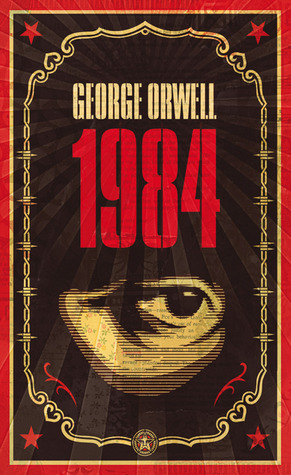
Consider how different covers for the same classic, like 1984 or Dune, can evoke entirely different moods and attract distinct audiences. A minimalist, stark cover might appeal to readers seeking intellectual depth, while a vibrant, illustrative one draws in those looking for immersive escapism. The visual language—color, typography, imagery—creates an immediate emotional connection or dissonance, often before a single word of the synopsis is read. In today's competitive market, where attention spans are fleeting, a strong, resonant cover is more crucial than ever for a book to stand out and find its audience.
The Art of Attraction: Why Covers Matter More Than Ever
In an age dominated by digital browsing and quick scrolls, a book's cover has only a split second to make an impact. Whether it's a thumbnail on an e-reader store or a prominent display in a physical shop, its ability to grab attention is paramount. Iconic covers, like those for the Harry Potter series, become synonymous with the stories they represent, fostering recognition and loyalty among fans. They transcend mere packaging to become cultural touchstones.
From signaling the target audience (think the distinct visual styles for YA vs. adult fantasy) to evoking specific emotional responses, cover art is a sophisticated blend of artistic expression and strategic marketing. It's a silent promise to the reader, a curated glimpse into the journey that awaits them. As readers, we subconsciously interpret these visual cues, allowing them to guide our choices and shape our expectations, proving that while we shouldn't solely judge a book by its cover, it’s undeniably a powerful and often accurate window into its soul.
The Verdict: A Cover That Casts a Powerful Spell
The cover of Harry Potter and the Goblet of Fire largely succeeds in its mission. It’s an engaging, dynamic visual that perfectly captures the escalating adventure and danger within its pages. It's a testament to effective book cover design, serving as an excellent example of how artwork can both entice new readers and resonate deeply with existing fans. So, the next time you're browsing for your next literary escape, take a moment to appreciate the art before the words – it might just tell you more than you think.